
Exhibitor guide
Getting Your Booth Graphics Print-Ready
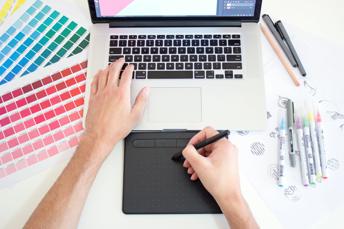
The file setup that saves you from blurry walls and last-minute reprints.
Great design can still print badly. Every exhibition season, stands go up with pixelated logos, colours that don't match the brand, and text cut off at the edge of a panel, not because the design was wrong, but because the artwork files weren't set up for large-format print. Here's a plain-English guide to getting your booth graphics print-ready, whether you're briefing a designer or supplying the files yourself.
Resolution: think in viewing distance, not just DPI
The biggest worry people have is resolution, and the biggest myth is that everything needs to be 300 DPI. For a small flyer held in your hand, yes. For a three-metre wall you view from a metre or two away, no, and insisting on it can make your files enormous and unworkable.
What matters is how the image looks at the distance people actually stand. Large-format graphics are typically built at a lower DPI at full size precisely because they're seen from further away. The key is to work at the real print scale, or a clean fraction of it, so nothing gets stretched. A logo dragged up from a tiny web file will look soft no matter what DPI you label it.
What to do instead of upscaling: Always start from the highest-resolution or, better, vector version of your logo and key graphics. Never enlarge a small raster image and hope.
Colour: your screen is lying to you
Screens display colour in RGB and glow with backlight. Print uses CMYK inks on fabric or substrate, and it can't reproduce every bright colour your monitor can. That vivid screen blue often prints noticeably duller. This is the single most common cause of "the colour came out wrong."
What to do instead of trusting the screen: Supply your brand colours as specific values, ideally a Pantone reference plus the CMYK breakdown, rather than relying on how they look on your monitor. If colour accuracy is critical, ask for a printed proof before the full run.
Bleed and safe zones
Printing and trimming aren't perfect to the millimetre. "Bleed" means extending your background slightly past the final edge so there's no white sliver if the cut shifts. The "safe zone" is the opposite: keep logos and text in from the edge so nothing important gets trimmed off or disappears around a corner or into a frame channel. Both are easy to forget and painful to fix once it's printed.
Fonts and file formats
Two things trip people up at the final hurtle. First, fonts: if you send a layout without supplying or outlining the fonts, the printer's machine substitutes whatever it has, and your carefully chosen typeface turns into something else. Convert text to outlines or supply the font files. Second, format: vector files (PDF, EPS, AI) stay crisp at any size and are ideal for logos and type. High-resolution raster files (TIFF, PNG) are fine for photographic imagery, as long as they're built at scale.
Build to the template, not to a guess
Every stand has exact print dimensions, and they're rarely a tidy round number once you account for the frame, the wrap, and any areas hidden behind hardware. Designing to a guessed size and resizing later is how text ends up off-centre or cut off.
What to do instead: Ask your supplier for the print template for your specific stand before you start designing, and build directly onto it. It's the simplest way to guarantee everything lands where you intended.
The bottom line
Print-ready artwork comes down to a few habits: start from vector or high-resolution source files, work at the real scale, specify your colours properly, allow for bleed and safe zones, and build to the actual template. Get these right and what you see in the design is what you get on the hall floor. If you'd rather hand it over, send us your brand assets and we'll handle the print setup for you.
Photo by Theme Photos on Unsplash
Need a hand getting your artwork print-ready? Send it our way.
Plan your booth
Make your next expo count.
Choose a booth you like. We’ll help make it yours.
Exhibitor guide
One Exhibition Kit, Different Stand Sizes: Plan the Layouts Before You Buy
Check your smallest and largest booked spaces together, then build a clear component and packing plan for each version of the stand.
Read the guide ↗
Exhibitor guide
Sharing an Exhibition Stand With a Partner: What to Agree First
Keep a shared stand clear and workable by agreeing on the visitor story, brand hierarchy, responsibilities and enquiry handover before design begins.
Read the guide ↗
Exhibitor guide
An Exhibition Photography Shot List You Can Actually Use Afterwards
Plan the pictures your website, sales team and next event brief will need, instead of coming home with fifty versions of the same wide...
Read the guide ↗